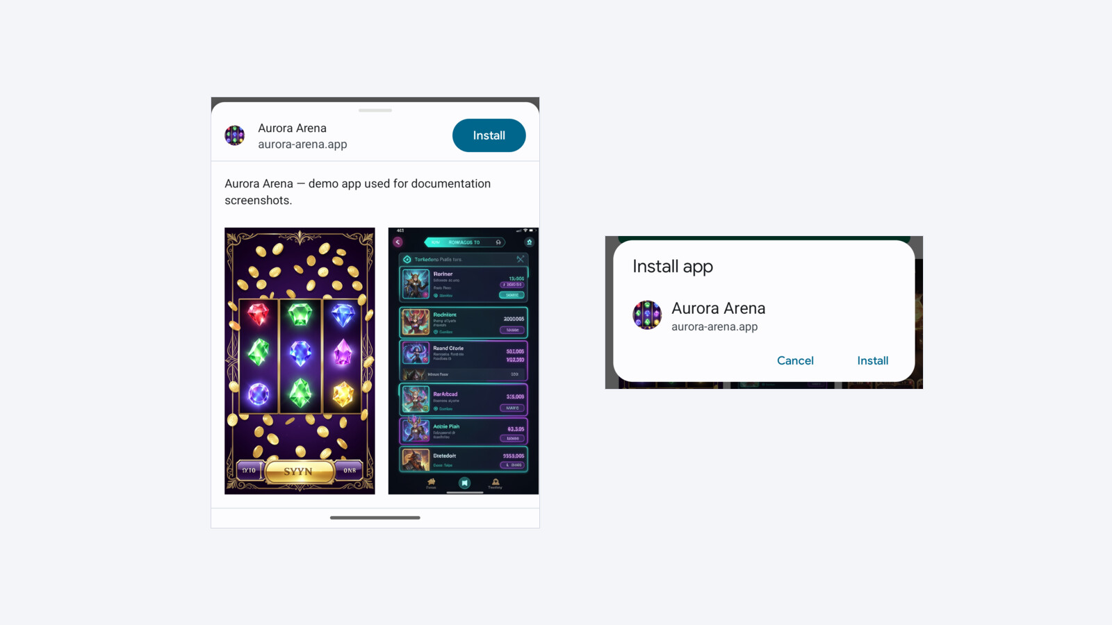
Open two of your own PWAs on the same Android phone and tap Install on each. There is a decent chance you get two different dialogs. One is a small card in the middle of the screen: icon, name, domain, Cancel, Install. The other is a tall sheet that slides up from the bottom, carries a description, and shows a scrollable row of app screenshots.
Nobody on your team chose either one. Chromium picked, and it picked from your manifest.
One field decides it
The switch is screenshots. If your Web App Manifest contains at least one entry there, Chromium swaps its compact dialog for the tall one and renders that gallery inside the install UI. Remove the field and you get the compact dialog back.
The entry has to be one Chrome can use on that device. On Android, screenshots marked form_factor: "wide" are ignored, and so are files outside Chrome’s size and aspect-ratio rules, so a manifest that only has those still gets the compact dialog.
description does not control the format. It only fills the paragraph of text inside the tall sheet — present it and the sheet has a description line, omit it and the sheet is the same sheet without that line.
Verified on Chrome 113 / Android 14, one device, one page, only the manifest changed between runs:
screenshots | description | What Chromium shows |
|---|---|---|
| present | present | tall sheet, gallery, description line |
| present | absent | tall sheet, gallery, no description line |
| absent | present | compact dialog |
| absent | absent | compact dialog |
That last pair is the one worth internalising. If you strip the description hoping to get the small dialog back, nothing happens — you just lose a legitimate manifest field and keep the sheet.
Phones use entries marked form_factor: "narrow" or entries with no form_factor at all; every capture here used narrow entries at their real pixel size. A screenshot whose declared sizes disagree with the actual file is the same class of mistake as a mis-declared icon, and it is worth getting right regardless of which dialog you want.
The two dialogs, same app, same phone
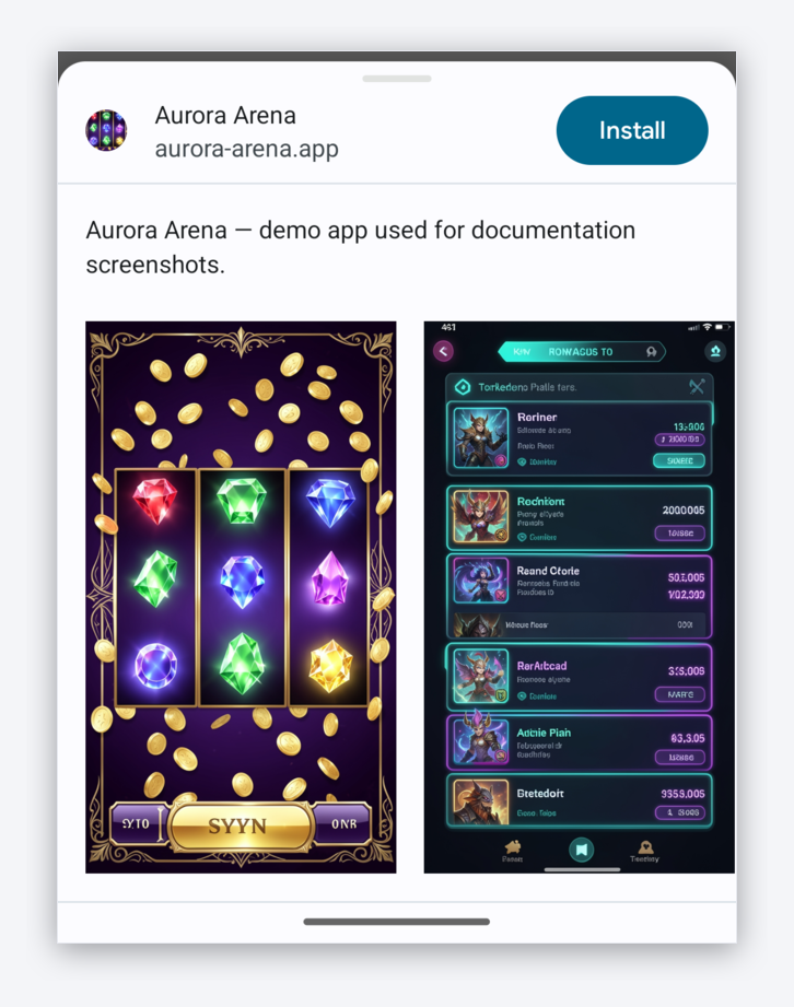
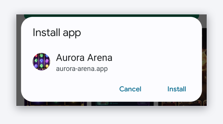
Both are real captures from the same demo app on the same device, seconds apart, cropped to the dialog. The page behind them is identical. The only difference between the two runs is whether screenshots was in the manifest.
What actually changes for the person holding the phone
The visual difference is obvious. The interaction differences are the ones that matter, and they are measurable. On a 1080×2220 screen:
| Tall sheet | Compact dialog | |
|---|---|---|
| Starts at | 37% down the screen | 42% down the screen |
| Covers | 63% of the screen, clipped at the bottom edge | 22% of the screen |
| Install control | pill in the sheet’s top-right, ~39% down | text button, ~60% down |
| Scrollable content inside | yes — the gallery, and the sheet itself drags | no |
| Ways to dismiss | tap outside, drag the sheet down, back | tap outside, Cancel, back |
Three things follow from that table.
The sheet invites a second decision. A gallery is content. Content asks to be looked at, and a horizontally scrollable row asks to be swiped. You have put a browsable object between the visitor and the button they were already reaching for. The compact dialog offers exactly two actions and no third thing to do.
The Install control moves up, not down. On the tall sheet the Install pill sits at roughly 39% of screen height, in the top-right corner of the sheet. On the compact dialog it sits at roughly 60%, comfortably inside the thumb arc on a large phone. Higher on the screen is not better here; it is further from the thumb.
The sheet is draggable, and drag is how phones dismiss things. A visitor who touches the sheet and moves their finger down has dismissed the install. The same gesture on the compact dialog does nothing at all.
Why this lands at the worst possible moment
Everything before the dialog is your page: your copy, your gallery, your CTA. You spend the whole visit building intent up to a single tap. The dialog is the first moment the browser takes over the screen, and it is the last moment before the install actually happens.
That is a bad place to introduce a new browsable surface. The visitor already made the decision your page asked for. Whatever the dialog shows them next can only confirm that decision or interrupt it — and the gallery inside the sheet is a duplicate of the gallery they already scrolled past on the page, so confirmation is not really on offer.
None of that is a reason to panic. It is a reason to know which one you are shipping.
How to check what yours does right now
Three ways, cheapest first.
Read your own manifest. Open the PWA’s manifest URL in any browser and look for screenshots. If the array is there and has at least one entry phones can use, you are shipping the tall sheet.
curl -s https://your-domain.example/manifest.json | grep -c '"screenshots"'Or paste the whole file into our PWA manifest validator, which shows the screenshot entries Chrome would use on phones and on desktop alongside the install criteria.
Check it in DevTools. Connect the phone, open chrome://inspect, and read the Application → Manifest panel. It lists the parsed screenshots and warns about entries Chromium rejected — a rejected screenshot is exactly as good as no screenshot for this purpose.
Watch a real install. Nothing beats installing your own app on a real device once per release. The dialog is the single screen in the funnel you cannot see in your analytics.
How to switch
Removing the screenshots array from the manifest is the whole change. Keep everything else: your icons decide whether the install prompt appears at all, and your description is a normal manifest field that belongs there.
This is worth saying plainly because the two are easy to confuse. Deleting your icons does not give you the compact dialog — it makes the app uninstallable and no dialog appears at all.
In DarkCore this is a per-PWA setting rather than a manifest edit. Under Conversion hooks there is a Rich install dialog toggle, and it ships off: the manifest goes out without screenshots and visitors get the compact dialog. Turn it on and the manifest carries your gallery into the sheet.
Either way the store page keeps its gallery exactly as it is. The gallery on the page is not what Chromium reads — only the manifest is — so the toggle costs you nothing visually before the tap.
What we do not know yet, and neither does anyone else
We have not measured which dialog converts better. Neither, as far as we can tell, has anyone else in public.
The case for the compact dialog is the one made above: fewer competing actions, a Install control closer to the thumb, no drag-to-dismiss. The case for the tall sheet is that screenshots reassure a visitor who is one tap from installing something from a domain they have never heard of. Both are plausible. Only your own traffic can settle it, and the answer may well differ by geo and by vertical.
If you run that test, run it properly:
- one variable — the dialog format, nothing else on the page;
- split by device and browser, since only Chromium shows either dialog and in-app browsers show neither;
- measure install-per-tap, not install-per-click, so webview escape rates do not swamp the comparison;
- keep it running long enough to survive a weekend.
The point of this article is not that one dialog wins. It is that until today you were shipping whichever one your screenshot upload happened to select, and that is a strange thing to leave to chance at the last screen before an install.
Related reading
- PWA apps in traffic arbitrage: funnel from click to FTD — where the install sits in the wider funnel
- Why your link opens the browser instead of the app — no install dialog exists inside an in-app browser
- Store fallback when the app is not installed — what to do with visitors who never reach the dialog
- Choosing a PWA service for affiliate marketing — what to look for besides the install screen